Disability affects around one billion people worldwide, or about 1 in 8. With so much of our lives being lived online, accessibility testing is a must to ensure that everyone, including those with different abilities, is able to access websites, applications, and platforms. While there is no quick band-aid fix to core accessibility problems, there are a few places to start that can significantly improve the experience for users with accessibility needs. Let’s have a look at the six simple fixes to improve web accessibility. We’ll be talking specifically about websites in these examples, but the principles are the same for any kind of digital tool.

1. Colour Contrast
Low contrast text was found on 86.4% of home pages, making it the most commonly detected accessibility issue. When it comes to improving the usability of a site for people with low vision or colour blindness, having the appropriate contrast ratio between the text and background colours will make the words on the page easier to read. The higher the contrast ratio between the two colors, the more accessible it becomes. The image slider below shows the difference between having a low-contrast website (left) compared to a high-contrast website (right).
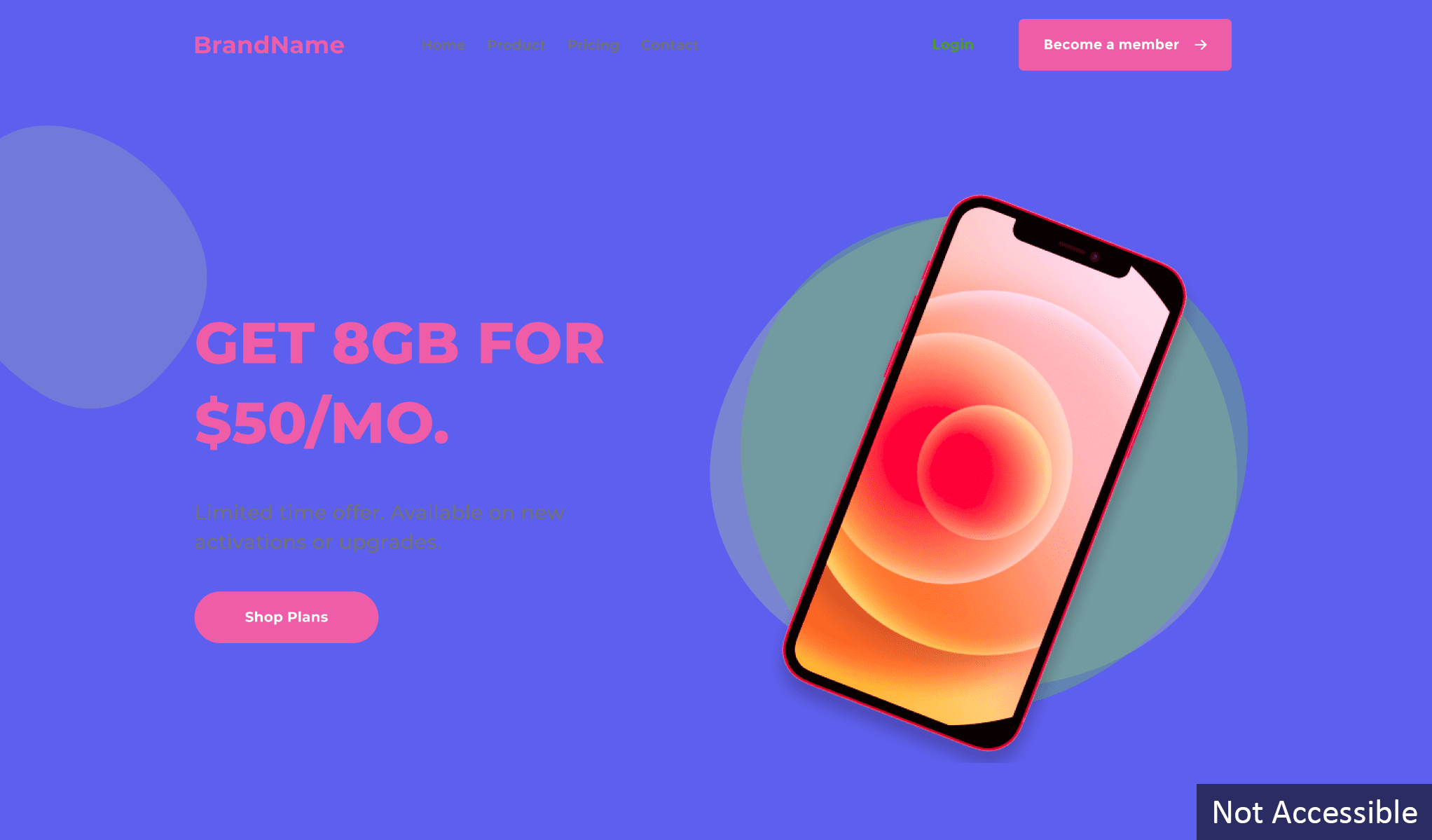
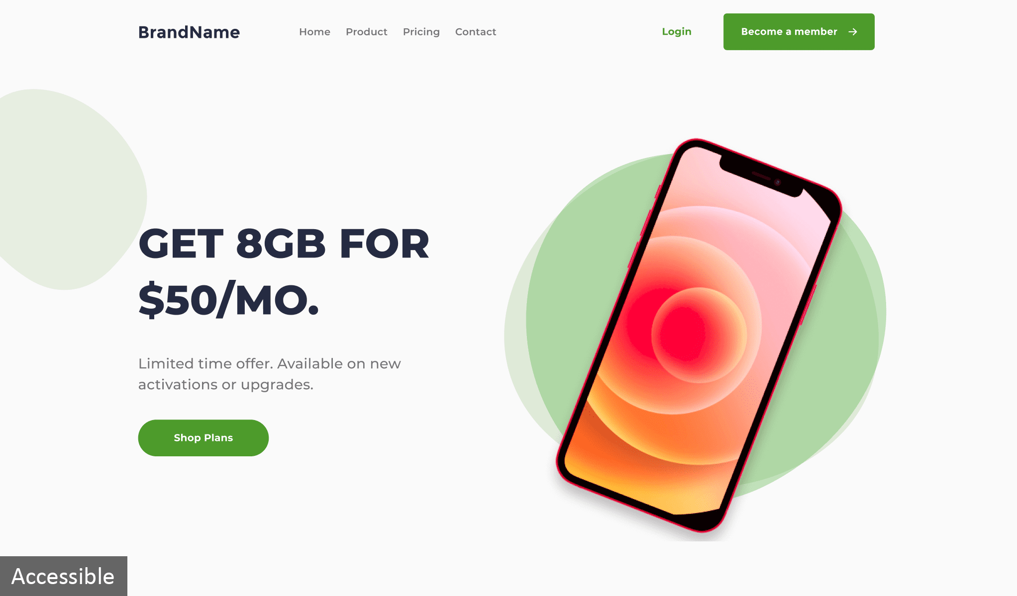
To view the accessible example, click the arrow and drag it to the left.
2. Image Alternative Text
Alternative text (or alt-text) is a description of an image, referred to in HTML as the “alt” attribute. It can also be used for elements including charts, graphs, and drawings. 26% of all home page images have missing alternative text. While not required for a simple photo that is decorative and provides no meaning, alt-text is essential for any images with text or logos over them. It allows meaning to be conveyed to those relying on the use of assistive technologies like screen readers. The right side of the image slider below shows the line of code that can be added to images to make them accessible for everyone.
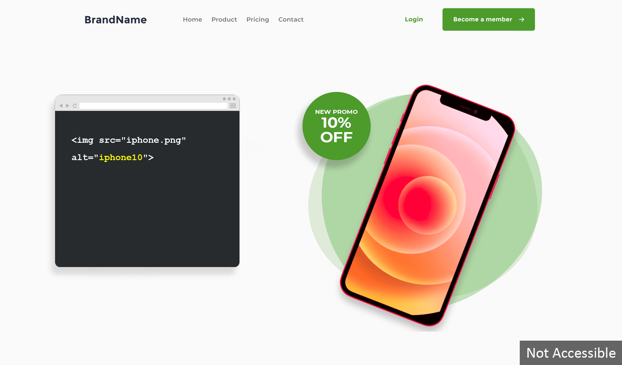
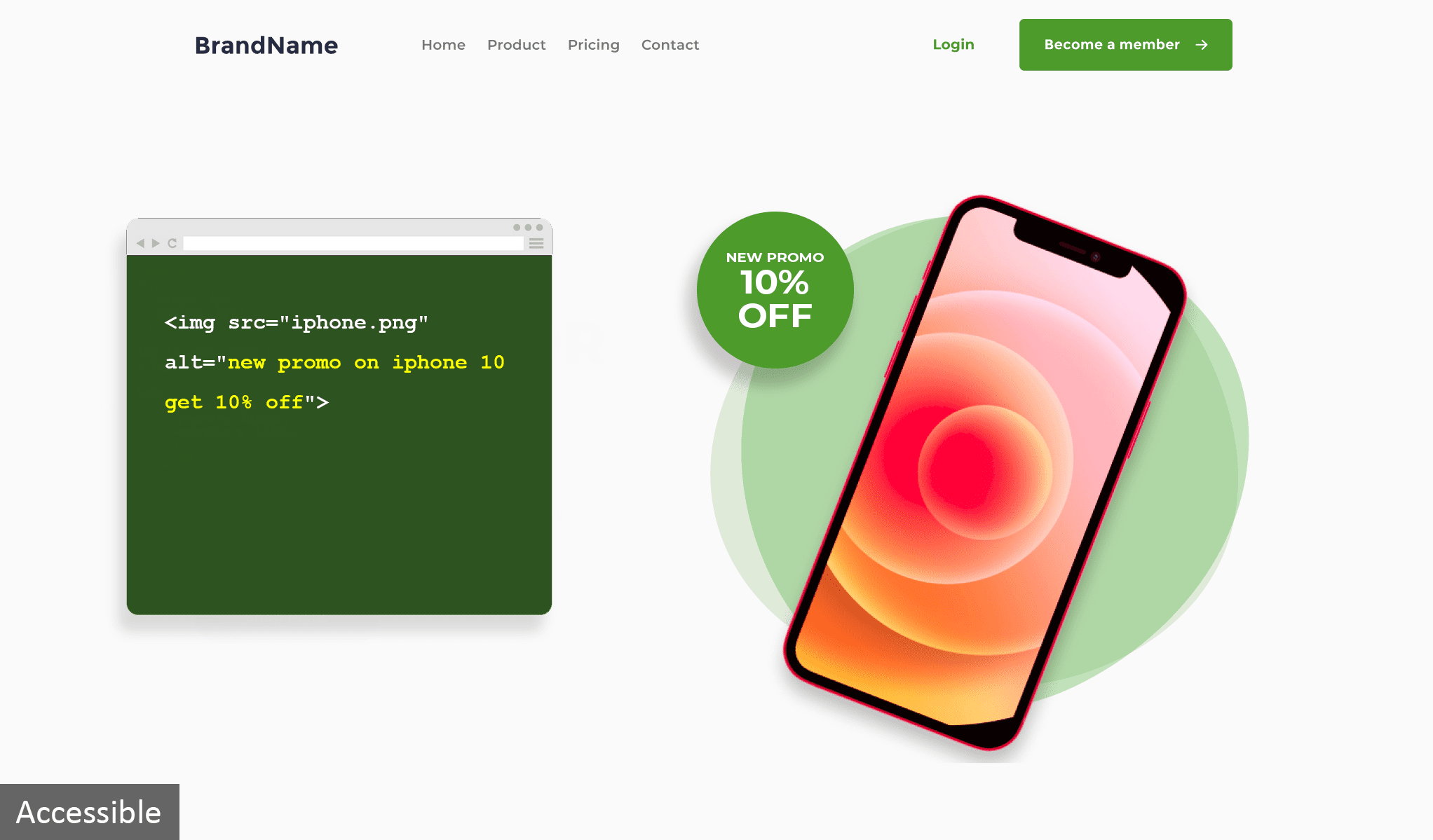
To view the accessible example, click the arrow and drag it to the left.
3. Links
Links on your web pages should always contain text to help users understand what the link is and that one is present. If the text describing the functionality is missing, it can be very confusing for keyboard and screen reader users as they will not know where the link will take them and therefore are less likely to be clicked on. You can avoid this by simply adding link titles to existing links on web pages. As shown in the image below, avoid using the same title and text because screen readers will read it twice which could be confusing for users.
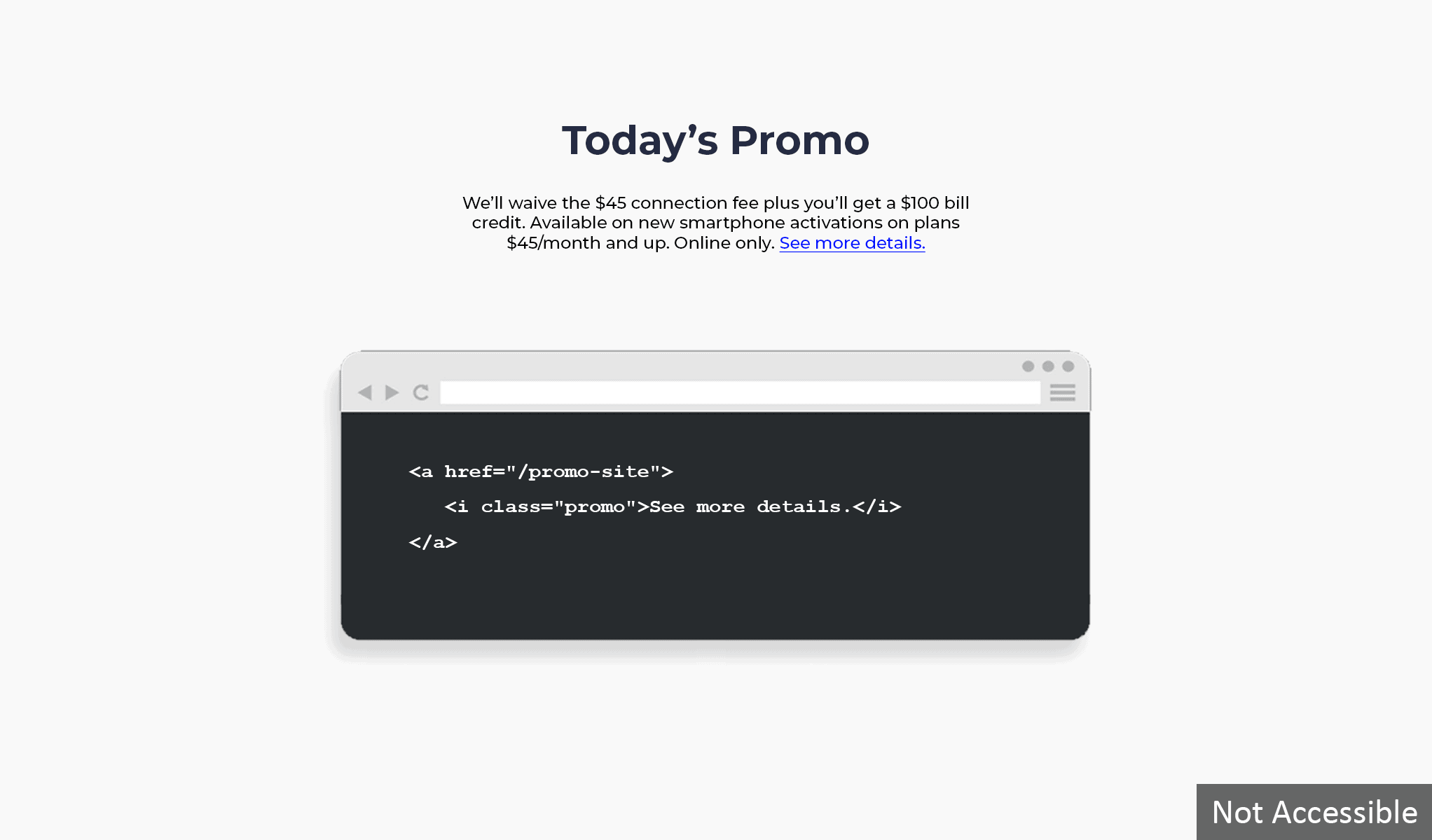
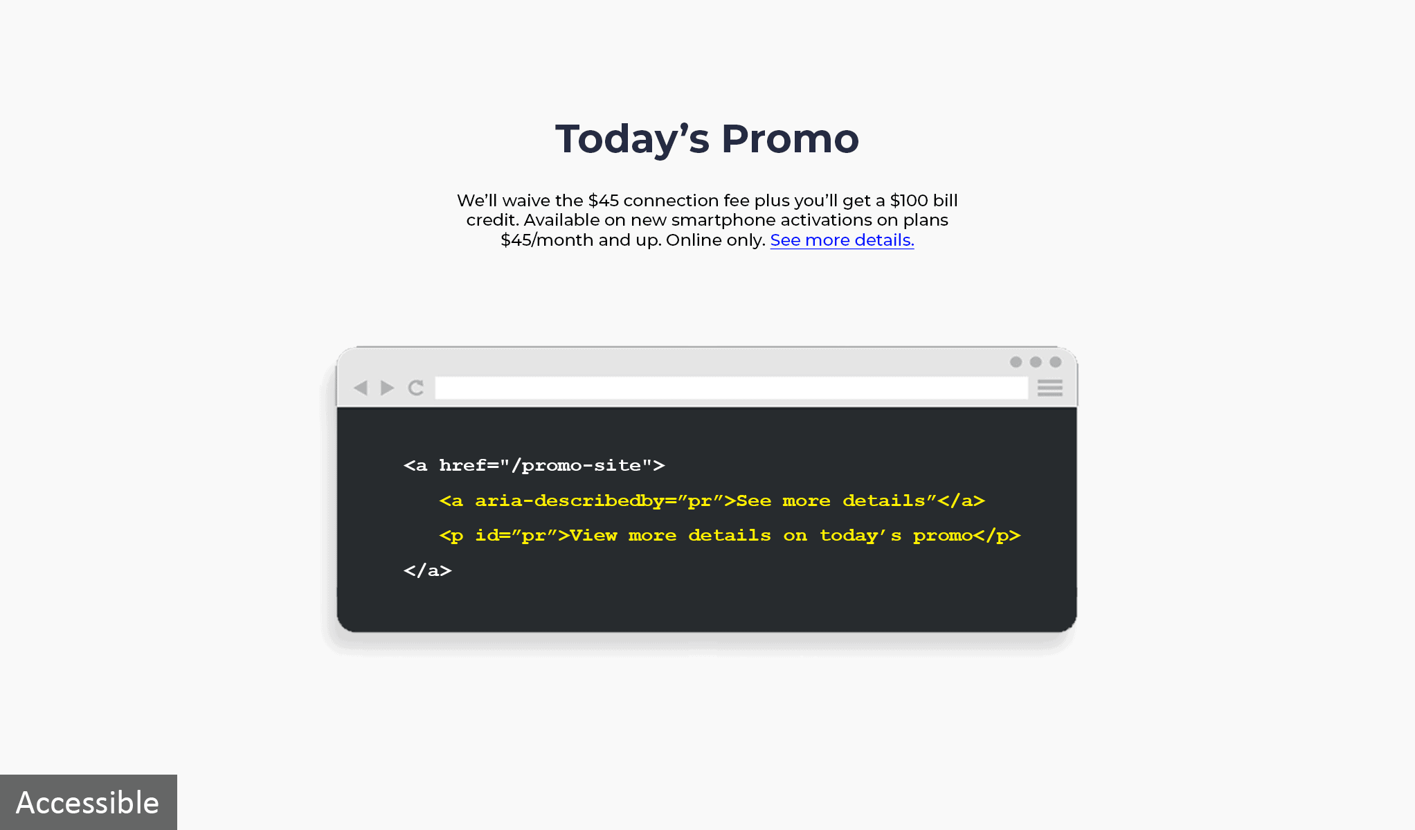
To view the accessible example, click the arrow and drag it to the left.
4. Form Labels
Form labels describe what you will find inside a field, and are a significant source of information for those who aren’t able to see a screen. Ensure that all form fields have accurate labels or prompt so that screen reader users know what each field is asking for. When you enter data into a form field, your cursor blinks inside the field. If users can’t see or hear the text inside the form field, they won’t know what kind of data to enter. In the example below, you can see a line of code that describes the form field.
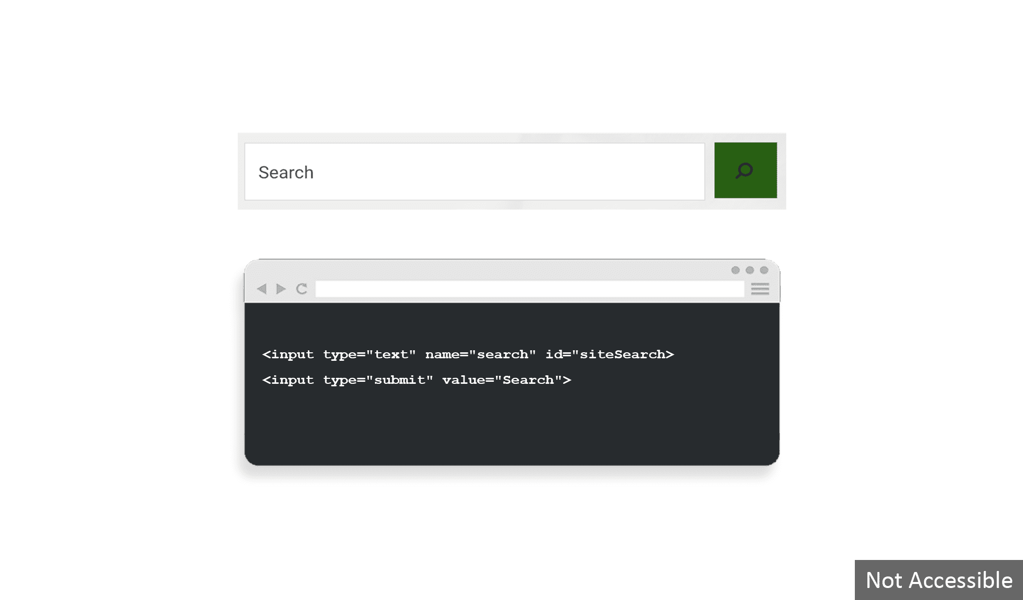
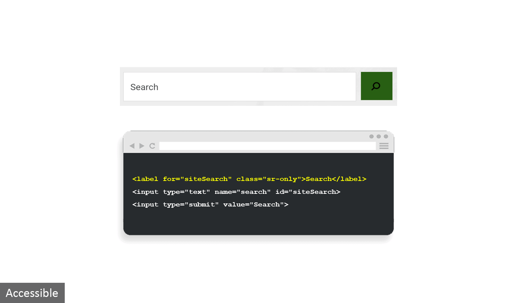
To view the accessible example, click the arrow and drag it to the left.
5. Screen Reader
The most common assistive technology used by people with visual impairment is the screen reader. A screen reader is a software that reads the content of a screen aloud or converts it to braille for blind users. The video below shows a sample of how a screen reader works.
6. Keyboard Accessibility
Keyboard shortcuts are an easy way to improve accessibility. Some users are physically unable to use a mouse and must navigate through websites using only the keyboard. Testing a digital product with a keyboard requires no special tools, simply try navigating your website or using your program relying only on the keyboard. The image below demonstrates that when you click on the “tab” button, a dotted lined box should appear to take users to the next link, form element, or button.
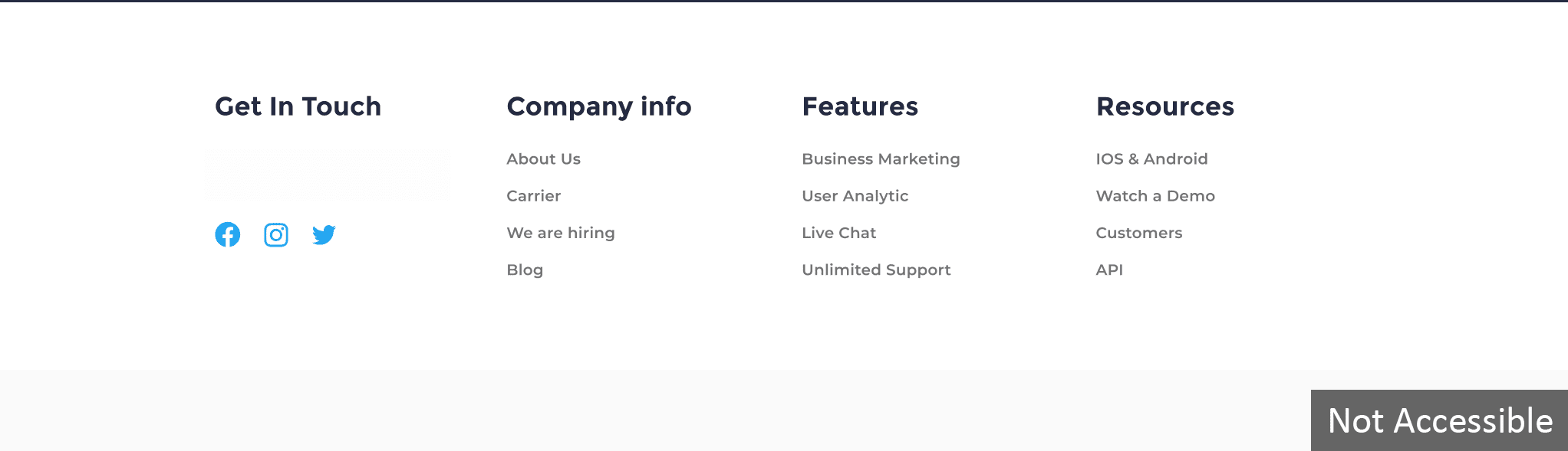
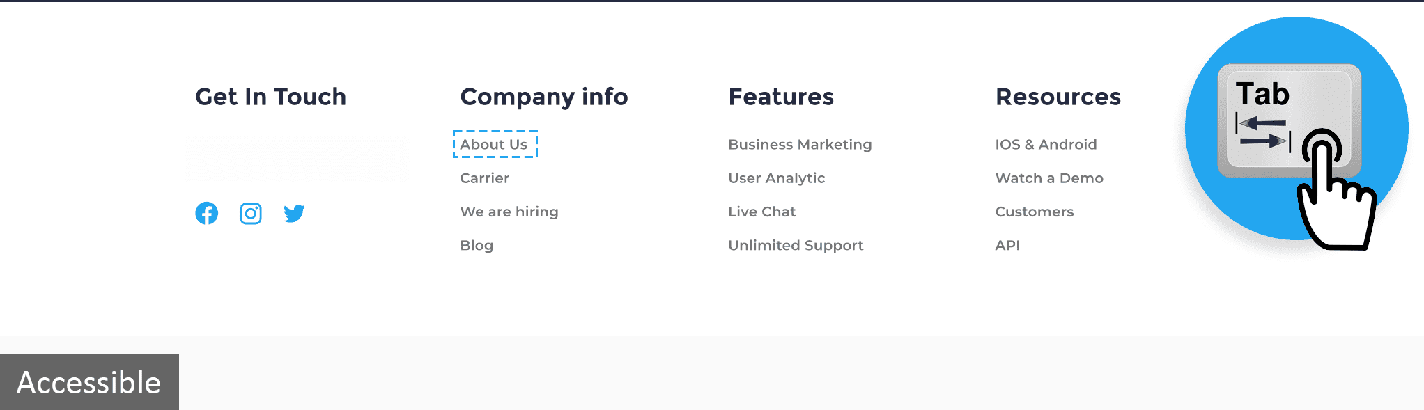
To view the accessible example, click the arrow and drag it to the left.
Looking for more insight on accessibility testing? This is one post in a series of three on accessibility; you can also listen to how developers, designers, and testing teams can level up their accessibility testing or read how free accessibility tools compare to having a dedicated accessibility testing team.

Abhishek is a QA evangelist who is passionate about quality assurance and testing at all levels of the organization. He is currently the Director of Service Delivery, Ontario, and also leads Web Accessibility TCoE at PLATO. Abhishek is PMP and has played key roles throughout his career in positions like Service Center Manager, Delivery Manager, QA Portfolio Manager, and led Managed Services Testing Teams spread across the globe. Abhishek loves to train and coach teams in software testing and its principles.